
History & Analytics
The History screen (/history) shows live and historical trends for every chartable
entity in one grid. It’s backed by TimescaleDB: raw samples for recent windows, and
continuous-aggregate rollups (per-minute / hourly / daily) for longer spans, so multi-week
charts stay fast.
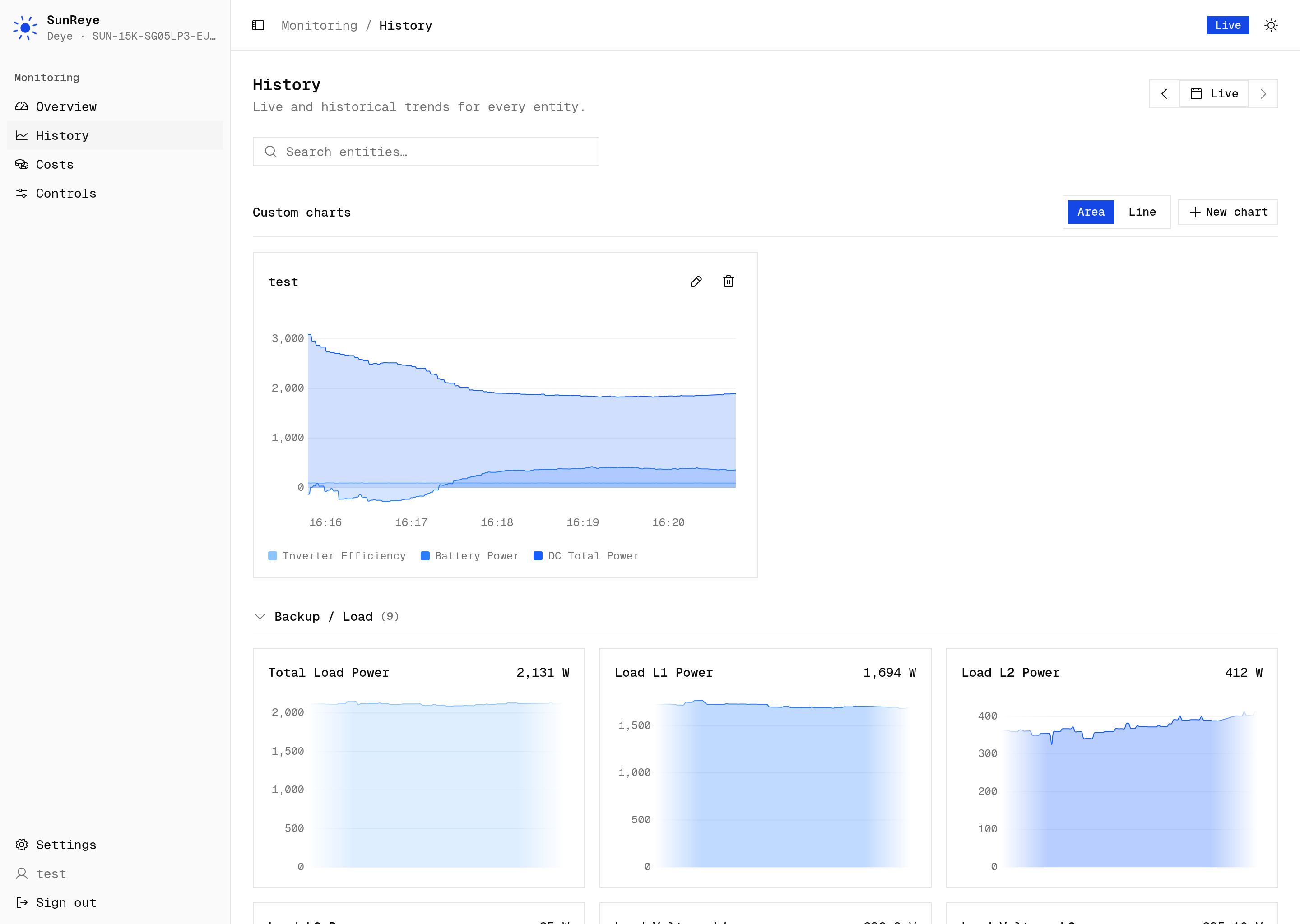
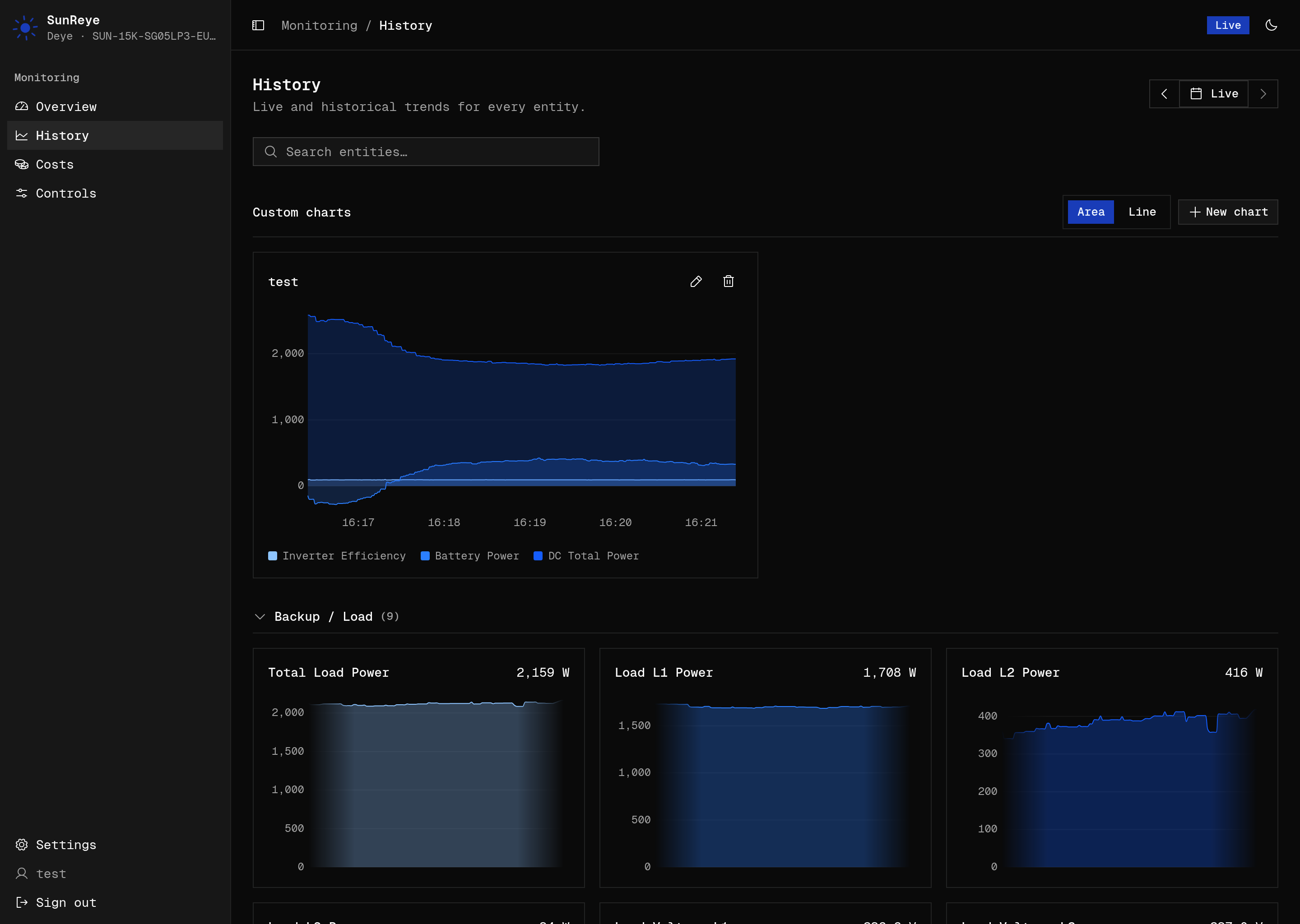
Layout
Section titled “Layout”- A date-range picker at the top controls the window for every chart at once.
- A search box filters entities by label or key.
- Entities are grouped into collapsible categories — Solar, Battery, Grid, Backup/Load, Consumption, Generator, Inverter — derived from each metric’s role. The grid is responsive (1–3 columns).
- Only “chartable” metrics (measurements and cumulative counters) appear.
Date range
Section titled “Date range”The picker offers presets — Live, 1 hour, 6 hours, 24 hours, last week, last 14 days, last month, last 6 months, last 12 months — plus a custom calendar range. The rollup bucket is chosen automatically from the span: per-minute resolution up to and including the last-week (7-day) window, and hourly for anything longer.
Day stepper
Section titled “Day stepper”Prev/next arrows flank the picker as one segmented control. Stepping drops into a single
local calendar day — [00:00, next 00:00), DST-correct — and the arrows then walk one civil
day at a time. From any non-day range (Live or a preset) the first step lands on today;
stepping forward past today returns to the realtime Live view. The trigger shows a
friendly label — Today, Yesterday, or the date — in the configured time zone.
The forward arrow is disabled only when Live (or another non-day range) is already showing.
Entity cards
Section titled “Entity cards”Each metric gets a card showing its title and live current value. Cards lazy-mount as you scroll, so a big grid stays light.
- In the Live range, the card draws a continuously gliding sparkline from the in-memory buffer.
- For any historical range, it fetches rollups and draws an area chart with a smooth curve, axes, gridlines, and a formatted tooltip.
- Signed metrics (those with a flow direction, like battery or grid power) use a red/green diverging gradient split at zero.
Custom charts
Section titled “Custom charts”Above the per-entity grid is a Custom charts section where you overlay several metrics on one chart — e.g. all PV strings, or battery vs. grid power together.
- New chart (admin only) opens an editor: name it and tick up to 8 metrics from the same category-grouped, searchable list the grid uses. Edit or delete a chart from its card.
- Charts follow the page’s date range (including the day stepper and Live), so all of them move together with the entity grid.
- An Area / Line toggle switches the render style for every custom chart at once. It’s a view-only choice — not saved per chart.
- Saved charts are stored server-side and shared across the instance. Non-admins see the charts but can’t create or edit them; the section is hidden entirely for non-admins when none exist yet.
Retention
Section titled “Retention”Raw samples are kept for a bounded window (recent history), while the rollups retain long-range trends cheaply; older telemetry is compressed and cleaned up automatically. This is why the very long ranges draw from rollups rather than raw rows.